Page 3 of 4
Posted: Mon Feb 12, 2007 4:53 am
by Blake
Posted: Tue Feb 13, 2007 8:18 am
by DaledeSilva
okay...
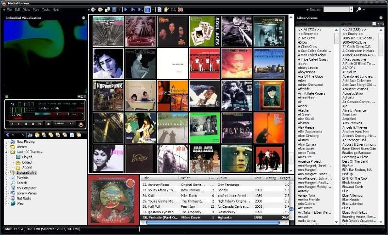
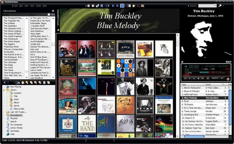
I've folded and decided to post this skin even though it's far from complete.
here's the link:
http://www.oiltinman.com/plugins/Skins/ ... .02.14.wsz
Dale.
Posted: Wed Feb 14, 2007 7:48 pm
by DaledeSilva
no one's tried it?
Posted: Wed Feb 14, 2007 10:21 pm
by Steegy
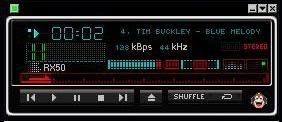
It looks nice (as in your screenshot somewhere around here), but
DaledeSilva wrote:...it's far from complete.
Posted: Thu Feb 15, 2007 12:09 am
by Blake
i've tried it. Looks excellent. I can's see much incomplete stuff. Congratulations and well done
Posted: Thu Feb 15, 2007 12:20 am
by rovingcowboy
DaledeSilva wrote:no one's tried it?
wow. the skin on the player is nice the rest i could not see.
the white from the listview area was over powering and blinding.
it washed out the details of the black part of the skin.
i had to go back to the other skin quick. don't feel bad though i hate white backgrounds any place including forums. their all too blinding.
see if you can make the list views and tree backgrounds an off white pastel color of sorts kind of like a putting a light light light gray filter over the white image to tone it down some. i felt like i was just punching in the dark for the right button. except on the player i could see that fairly well.
you might hear me saying this if i put it on the player again the way it is now. ?
"Turn down the contrast some i can't see a thing


"

well thats my review of it so far is that good enough feedback?

Posted: Fri Feb 16, 2007 7:07 am
by Sebastian78
Mr Silva, loved you site btw!
The piano black look amazing.......woff
Posted: Tue Feb 20, 2007 11:58 am
by gab
Dale:
I really like your new skin. However my player and alternating rows in the track list do not change just the borders. Am I doing something wrong?
Posted: Tue Feb 20, 2007 6:50 pm
by DaledeSilva
um... I don't know, gab... if the borders change then I guess you're doing it right.. the only thing I could say would be make sure both the check boxes under the skin list in options are UNCHECKED.
sebastian78... that is a sweet name (piano black).. mind if I (possibly) use it?.. the skin's changed a fair bit as I've been tailoring it for MM 3.0 and sleek-Black was always a working title.
Dale.
Posted: Wed Feb 21, 2007 12:02 am
by Blake
There is a dark sort of skin for MM3 only on my signature, the one i am talking about is Royal Dark Grey
help
Posted: Mon Mar 05, 2007 8:30 pm
by aidan_cage
I started to do a bit of work on this today. I got the player cleaned up and slapped the Monkey on it, but I want to know how to get the text in the tree, list, and playing areas white. I have seen other skins with the text in these areas white, but I haven't seen how to do it around here. Also I should probably find out how to get the Library Panes skin changed too.
Any help would be as wonderful as ever.

PEACE - Tristan
I used the sleek black/piano black skin DaledeSilva released not too long ago and popped a slightly gimped player in to make it more MM. Thanks to DaledeSilva
Please point me toward where I can learn how to change the text of the Tree, Playing, List sections to white. I want to make those windows have a pure black back, so I can have a dark black skin for actual. Maybe you know how to change the blue sliders, and the highlight bar?
Sorry about the long post, but I am half way done and looking for direction.
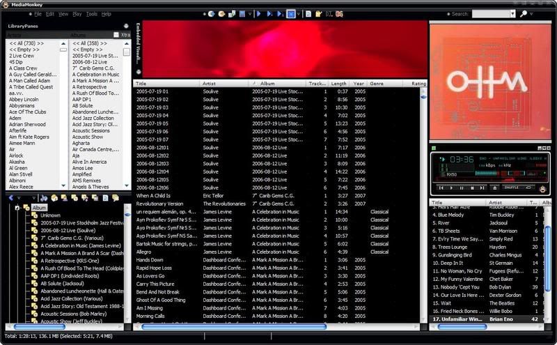
so I figured out the colour changing from another thread, but it just lead to a string of other problems and things I need to change to be happy

please feedback
Posted: Mon Mar 05, 2007 10:46 pm
by blakeloth1-not logged in
Posted: Tue Mar 06, 2007 1:00 am
by Morten
Not to be cruel, but it's more like the XP version. The Vista version has glass and I've asked the developers the possibility to give us that.
Posted: Tue Mar 06, 2007 1:13 am
by rovingcowboy
Morten9300 wrote:Not to be cruel, but it's more like the XP version. The Vista version has glass and I've asked the developers the possibility to give us that.
what's that you said??
i read in to your statement that in vista they made the player look like
a tv set setting with in a tv set. by making it look like a pane of glass is covering the front just like the tube on the tv set?
is that what your saying? if so get a screen shot for us cause i'd like to see that. i got ideas of how to do it but would like to see it to confirm my ideas.
Posted: Tue Mar 06, 2007 1:26 am
by Blake
no, that isn't what he means! He means that you can see through the titlebar and edges of the screen like this:
WARNING - HIGH RES IMAGE
http://www.vistaarticles.com/content_im ... -wmp11.png