ZuneSkin [v1.6]
Posted: Sat Oct 13, 2007 1:39 pm
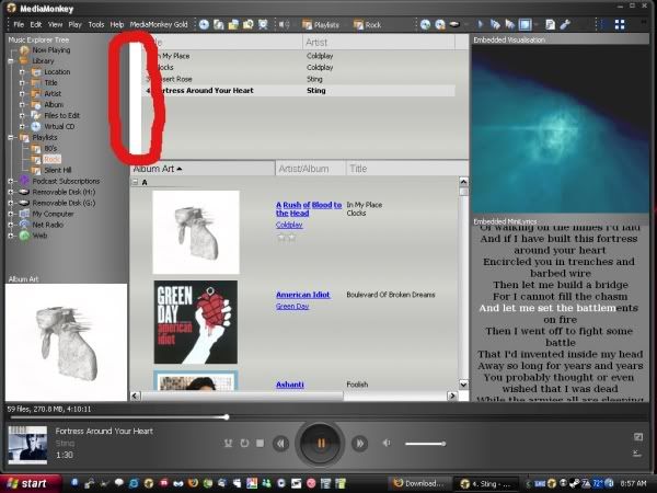
Skin preview available here (smaller preview for slower connections) or here (large image)
Download v1.6.2 - ZuneSkin (Original) - Run the mmip file, the skin will install automatically. Change your skin in Tools --> Options --> Skins
Download v1.6.2 - ZuneSkinSP (Small Player version) - Run the mmip file, the skin will install automatically. Change your skin in Tools --> Options --> Skins
Download v1.6.2 - ZuneSkinSlim (Slim Float Player version) - Run the mmip file, the skin will install automatically. Change your skin in Tools --> Options --> Skins
Download v1.6.2 - ZuneSkinSPSlim (Small main player / Slim float player version) - Run the mmip file, the skin will install automatically. Change your skin in Tools --> Options --> Skins
--
Download link is also available on the Wiki
This is my first skin. I'm excited to eventually make an original skin, but its much easier the first time around basing your player on something already done to get the feel of the skin editing tools.
I hope you like my skin, feel free to leave comments (please go easy on me! )
)
Also for anyone who has a Zune, and is interested in trying to sync it with Mediamonkey, I have created a guide on how to do so.
Ver 1.1 - Fixes
-Improved tree background
-Added installation package - (you can run this right over the old skin, no need to delete it)
Ver 1.2 - Fixes
-Added close button in docked panels
-Fixed pressed state of previous button
-Centered pause glyph
-Cleaned up FloatPlayer artifacts
-Fixed blank titlebar
Ver 1.3 - Improvements - (Thanks gege & Morten!)
-New Info Popup panel
-Improved Micro Player
-Allow for resizable player
-Cleaner Float Player
Ver 1.3.1
-Added Now Playing list button to Float Player
-Fixed track elapsed time on Float Player
-Added shuffle button to Float player
-Added status indicator to Float player (pause/play/stop)
-Larger Main Player clickable area for play/pause button
Ver 1.3.1.1
-Fixed seekbar transparency
-Added changeable track time in main player
Ver 1.3.1.2
-Fixed title length too long
-Fixed volume bar in Float Player not centered
Ver 1.3.1.3
-Fixed Album art inconsistency
-Song title scrollable area fixed
Ver 1.4.0.0
-Album Art Update
-Fixed Mute Button
-Fixed Volume Bar
-More skin consistency
-Added Visualizer
-Improved MicroPlayer
Ver 1.4.1.0
-Added small player option
-Improved MicroPlayer
Ver 1.4.1.1
-Makes Album Art view more readable
-SP version added minimize to Microplayer button, removed white border
-SP Player resizing issues are a known bug
Ver 1.4.2
-Workaround released for ZuneSkinSP and resizing issues
Ver 1.4.3
-Album Art views improved
-Vertical Microplayer added
Ver 1.4.4
-Added stop button to float player
-Changed placement of mute button on float player
-Fixed reversed minimize/switch buttons on ZuneSkinSP player
Ver 1.4.5 - (Thanks Rovingcowboy!)
-Fixed a small bug where sometimes song title and artist would not appear in the player
Ver 1.4.6
-Minor fix - "Cleanup" of window borders
Ver 1.5
-Darker album art panel
-Smoothed status and control bars
-Improved "OK" and "Cancel" buttons
-Improved Float player
-Theme color change (see options panel,
properties panel, Add/Rescan panel, etc.)
Ver 1.6
-kbps indicator added (original only)
-Timer display error fixed
-Major ZuneSkinSP player improvement
Ver 1.6.1
-Next/Prev button fixed clickable area
-Better volume bar on float player
-Moved kbps indicator next to timer
Ver 1.6.1.1 (ZuneOriginal update only)
-Fixed buttons on start up
Ver 1.6.1.3
-ZuneSkinSlim release (no changes to ZuneSkin or ZuneSkinSP)
Ver 1.6.1.4
-Fixed some button errors
-Improved seekbar (SP versions)
Ver 1.6.2.0
-Updated scroll bars (to better match theme)
-Updated selection (to better match theme)
Download v1.6.2 - ZuneSkin (Original) - Run the mmip file, the skin will install automatically. Change your skin in Tools --> Options --> Skins
Download v1.6.2 - ZuneSkinSP (Small Player version) - Run the mmip file, the skin will install automatically. Change your skin in Tools --> Options --> Skins
Download v1.6.2 - ZuneSkinSlim (Slim Float Player version) - Run the mmip file, the skin will install automatically. Change your skin in Tools --> Options --> Skins
Download v1.6.2 - ZuneSkinSPSlim (Small main player / Slim float player version) - Run the mmip file, the skin will install automatically. Change your skin in Tools --> Options --> Skins
--
Download link is also available on the Wiki
This is my first skin. I'm excited to eventually make an original skin, but its much easier the first time around basing your player on something already done to get the feel of the skin editing tools.
I hope you like my skin, feel free to leave comments (please go easy on me!
Also for anyone who has a Zune, and is interested in trying to sync it with Mediamonkey, I have created a guide on how to do so.
Ver 1.1 - Fixes
-Improved tree background
-Added installation package - (you can run this right over the old skin, no need to delete it)
Ver 1.2 - Fixes
-Added close button in docked panels
-Fixed pressed state of previous button
-Centered pause glyph
-Cleaned up FloatPlayer artifacts
-Fixed blank titlebar
Ver 1.3 - Improvements - (Thanks gege & Morten!)
-New Info Popup panel
-Improved Micro Player
-Allow for resizable player
-Cleaner Float Player
Ver 1.3.1
-Added Now Playing list button to Float Player
-Fixed track elapsed time on Float Player
-Added shuffle button to Float player
-Added status indicator to Float player (pause/play/stop)
-Larger Main Player clickable area for play/pause button
Ver 1.3.1.1
-Fixed seekbar transparency
-Added changeable track time in main player
Ver 1.3.1.2
-Fixed title length too long
-Fixed volume bar in Float Player not centered
Ver 1.3.1.3
-Fixed Album art inconsistency
-Song title scrollable area fixed
Ver 1.4.0.0
-Album Art Update
-Fixed Mute Button
-Fixed Volume Bar
-More skin consistency
-Added Visualizer
-Improved MicroPlayer
Ver 1.4.1.0
-Added small player option
-Improved MicroPlayer
Ver 1.4.1.1
-Makes Album Art view more readable
-SP version added minimize to Microplayer button, removed white border
-SP Player resizing issues are a known bug
Ver 1.4.2
-Workaround released for ZuneSkinSP and resizing issues
Ver 1.4.3
-Album Art views improved
-Vertical Microplayer added
Ver 1.4.4
-Added stop button to float player
-Changed placement of mute button on float player
-Fixed reversed minimize/switch buttons on ZuneSkinSP player
Ver 1.4.5 - (Thanks Rovingcowboy!)
-Fixed a small bug where sometimes song title and artist would not appear in the player
Ver 1.4.6
-Minor fix - "Cleanup" of window borders
Ver 1.5
-Darker album art panel
-Smoothed status and control bars
-Improved "OK" and "Cancel" buttons
-Improved Float player
-Theme color change (see options panel,
properties panel, Add/Rescan panel, etc.)
Ver 1.6
-kbps indicator added (original only)
-Timer display error fixed
-Major ZuneSkinSP player improvement
Ver 1.6.1
-Next/Prev button fixed clickable area
-Better volume bar on float player
-Moved kbps indicator next to timer
Ver 1.6.1.1 (ZuneOriginal update only)
-Fixed buttons on start up
Ver 1.6.1.3
-ZuneSkinSlim release (no changes to ZuneSkin or ZuneSkinSP)
Ver 1.6.1.4
-Fixed some button errors
-Improved seekbar (SP versions)
Ver 1.6.2.0
-Updated scroll bars (to better match theme)
-Updated selection (to better match theme)