I need help from anyone willing!
It seems in the past that phone/tablet music app players and independent
portable music players only used the Title field to display titles.
But I know of at least one music app, Musicolet (android), that allows for
using the filename instead. This option is useful to me because I tend to
listen more in terms of whole albums than playlists and like that the
filenames, with a leading track number, order the songs in the proper way
an album should be. I don't want to have to put numbers on my titles for this
purpose.
The main reason I bring this up is because I have tried the newest version
of the MM app and it is looking fairly phenomenal compared to its predecessor.
However, unfotunately, it does not have that feature in the settings.
Because of this, I will likely stick with the Musicolet app.
Is there something I'm not getting? Am I incorrect about the history of
music players/apps? Anybody have an idea how this can be approached differently
and still be effective for what I want?
What's New In Version 2
Moderator: Gurus
Re: What's New In Version 2
MM user since 2003 (lifetime lic. 2012) "Trying to imagine life without music gives me a headache"
Top 2 scripts: RegExp Find & Replace (e.v.) and Magic Nodes (e.v.) ZvezdanD's scripts site
Please take a moment to read the bottom of the linked page to support the one and only - ZvezdanD! (the "originator" since 2006).
MMW 4.1.31.1919; 5.0.4.2690 || back it up...frequently!
|| software for power users: "Q-Dir" (free alt. to explorer) and file/folder renamer: "ReNamer" (den4b)
"The absurd is the essential concept and the first truth"

Re: What's New In Version 2
You mean that AlbumArtist is AWOL?North2South wrote: ↑Sun Apr 16, 2023 4:22 am What has happened to Album Artist, which I have used to sort my list (I use Artists for others involved e.g. band members)?
I would like to reintroduce sorting using this tab.
You can configure which nodes & sub-nodes are displayed, and the order in which they are listed:
- use the hamburger menu to go the the Home screen
- press the pencil (next to magnifying glass)
- open the Music node
- the first column is a three-way toggle: 1. hidden, 2. shown as a tab inside the node, or 3. also shown on the front page menu
- you can drag these sub-nodes to resequence
Want a dark skin for MM5? This is the one that works best for me .. elegant, compact & clear.
Re: What's New In Version 2
I don't understand your question.MMFrLife wrote: ↑Sun Apr 23, 2023 7:44 pm I need help from anyone willing!
It seems in the past that phone/tablet music app players and independent
portable music players only used the Title field to display titles.
But I know of at least one music app, Musicolet (android), that allows for
using the filename instead. This option is useful to me because I tend to
listen more in terms of whole albums than playlists and like that the
filenames, with a leading track number, order the songs in the proper way
an album should be. I don't want to have to put numbers on my titles for this
purpose.
I only play whole albums. And it would annoy me greatly if their tracks were played or listed out of proper sequence.
MMA behaves itself in this regard.
We can't see the specification of the sort sequence that MMA uses when displaying albums, but it will be AlbumArtist>Album>Disc#>Track# ... where disc numbers are used to disambiguate CDs in a boxset
See here ; MMA in Music>Album. The numbers alongside each track are coming from Disc & Track number tags, not the file name, nor the track title. "2" = "disc blank & track number 2.
Go to MMW, and look at one of your tracks. See the track that the MMA version was sync'd from here. The file name doesn't contain a track number prefix, which is fine, because MMA does not sort albums using track titles. .. So if I play that album, it plays in the expected track sequence.
Want a dark skin for MM5? This is the one that works best for me .. elegant, compact & clear.
Re: What's New In Version 2
If the tags are in order (Album, Album Artist, Disc# and Track#) the sorting should be as on the Album. Where in MMA is the sorting not like that for you?
Download MediaMonkey ♪ License ♪ Knowledge Base ♪ MediaMonkey for Windows 2024 Help ♪ MediaMonkey for Android Help
Lowlander (MediaMonkey user since 2003)
Lowlander (MediaMonkey user since 2003)
Re: What's New In Version 2
Thanks Barry4679 and Lowlander for jumping in.
Yeah, I guess that's right. The main advantage for filenames setting is to see extension and if you like having differences in naming convention/additional info between the two beyond the track number and prefer the filename for listening purposes.
Although, even if it orders them correctly according to the tags (without numbered titles), it's reassuring to see the track numbers in front (w numbered filenames). I will do a deeper dive into comparing the two apps later. I'm looking to using both of these now as the standard for anything else.
MM user since 2003 (lifetime lic. 2012) "Trying to imagine life without music gives me a headache"
Top 2 scripts: RegExp Find & Replace (e.v.) and Magic Nodes (e.v.) ZvezdanD's scripts site
Please take a moment to read the bottom of the linked page to support the one and only - ZvezdanD! (the "originator" since 2006).
MMW 4.1.31.1919; 5.0.4.2690 || back it up...frequently!
|| software for power users: "Q-Dir" (free alt. to explorer) and file/folder renamer: "ReNamer" (den4b)
"The absurd is the essential concept and the first truth"
Top 2 scripts: RegExp Find & Replace (e.v.) and Magic Nodes (e.v.) ZvezdanD's scripts site
Please take a moment to read the bottom of the linked page to support the one and only - ZvezdanD! (the "originator" since 2006).
MMW 4.1.31.1919; 5.0.4.2690 || back it up...frequently!
|| software for power users: "Q-Dir" (free alt. to explorer) and file/folder renamer: "ReNamer" (den4b)
"The absurd is the essential concept and the first truth"
Re: What's New In Version 2
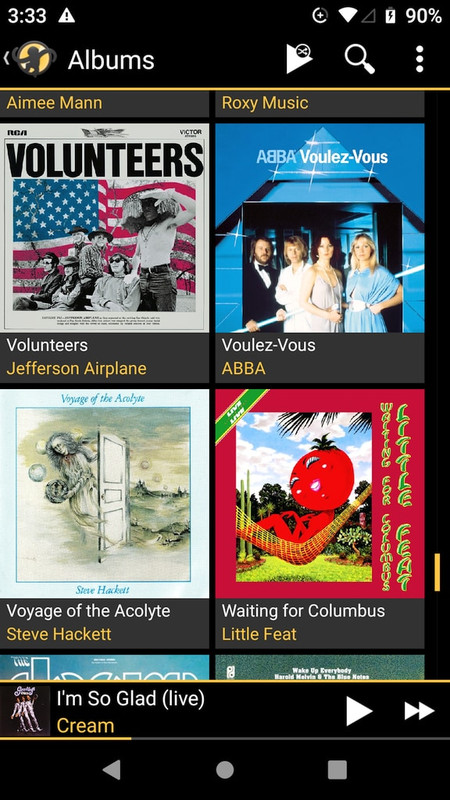
I don't like this, either. Not only do the details obscure the album art, the album art obscures the details. Depending on the color(s) of the art, the overlaid text is often barely or not readable. It's a poor solution - I liked it better before.Moonsorrow wrote: ↑Sun Apr 16, 2023 8:25 pm A couple of things I'm not currently enjoying about the new look.
1/ Album/Artist details obscure a third of the album art now rather than being placed underneath.
Re: What's New In Version 2
I can't remember what it was like before, so I am on the fence about whether it is better
However I do like the size of the album art in the grid.
My eyesight is not 100%, so I recognise albums the easiest via their album art.
If the old way meant smaller art thumbs, I would say that this way is better
Also I see a 2x3 grid. If the old way had a scroll window 2x2, then I would be happier with the current 3 rows.
I scrolled through all my sync'd albums. There are many. I had no trouble reading any of the overlaid text, although it is night here. It may be different I was outside in daylight.
Want a dark skin for MM5? This is the one that works best for me .. elegant, compact & clear.
Re: What's New In Version 2
As I recall, the album art was always 2-wide square, the same size as now, but maybe with a small info band below each picture, not overlaid. As it is now, my overlay is all black letters on translucent gray, so if the picture is dark, the letters tend to disappear.Barry4679 wrote: ↑Sat Apr 29, 2023 9:01 amI can't remember what it was like before, so I am on the fence about whether it is better
However I do like the size of the album art in the grid.
My eyesight is not 100%, so I recognise albums the easiest via their album art.
If the old way meant smaller art thumbs, I would say that this way is better
Also I see a 2x3 grid. If the old way had a scroll window 2x2, then I would be happier with the current 3 rows.
I scrolled through all my sync'd albums. There are many. I had no trouble reading any of the overlaid text, although it is night here. It may be different I was outside in daylight.
I'm going to fire up an old phone and try to take a screen cap of how it used to be.
{later edit...}
Here's the old display:
...as compared to now:
Re: What's New In Version 2
Hey Rednoise,
I see what you mean. Such cool albums, but looking really crappy in the latest version of MMA.
It is not what I see. It is because we have the UI setup differently.
You have Dark Mode turned off, and have the blue|while skin.
I have dark mode on, and the AmberGray skin.
See here with both side by side. The difference is even more stark on my phone, probably because the phone display has more resolution and has the brightness amped up.
The option set that you have chosen needs to go back to their drawing board, because visibility is very bad.
Looking at your before|after pix, you can see that the new version of MMA shows a 2*3 grid, vs the 2*2 grid in the previous version of MMA. ... That halves the amount of scrolling required, which is significant in a big collection.
Although neither of us gets a vote, my vote would be for the new version, after they fix up the visibility issues.
Want a dark skin for MM5? This is the one that works best for me .. elegant, compact & clear.
Re: What's New In Version 2
The 2x3 vs 2x2 grid would have to do with the proportions of the screen, I think. Looks like MMA 2 uses the screen real estate slightly more efficiently. But in my case, these are two different phones and my old one is shorter, with only enough room for 2-high. The new phone is longer, plus I don't need the Android navigation buttons, so I get 3-high.Barry4679 wrote: ↑Sat Apr 29, 2023 11:02 pm Hey Rednoise,
I see what you mean. Such cool albums, but looking really crappy in the latest version of MMA.
It is not what I see. It is because we have the UI setup differently.
You have Dark Mode turned off, and have the blue|while skin.
I have dark mode on, and the AmberGray skin.
See here with both side by side. The difference is even more stark on my phone, probably because the phone display has more resolution and has the brightness amped up.
The option set that you have chosen needs to go back to their drawing board, because visibility is very bad.
Looking at your before|after pix, you can see that the new version of MMA shows a 2*3 grid, vs the 2*2 grid in the previous version of MMA. ... That halves the amount of scrolling required, which is significant in a big collection.
Although neither of us gets a vote, my vote would be for the new version, after they fix up the visibility issues.
Having Dark Mode on or off makes a big difference. At least with the BlueWhite and BlueGrey themes, the overlay text is black (and unreadable) if Dark Mode is off, and white (and more readable) with it on.
It also appears that, when in Dark Mode, both BlueWhite and BlueGrey themes are identical! In non-Dark mode they are different.
Dark Mode+BlueWhite:
Dark Mode+BlueGrey:
Clearly, the color themes need some more work!
-
TheEmpathicEar
- Posts: 606
- Joined: Fri May 15, 2020 12:17 pm
 Re: What's New In Version 2
In what context was this fixed?Fixed:
"Bluetooth playback"
Re: What's New In Version 2
Greetings,
there is some thing in the 2.0 Version which i greatly dislike and after reding all this Topics maybe its my fault because i dont take the config right.
In the previous versions the Home Screen "Tiles" (Albums,Genres,Tecks,sync now etc) are automatically resizing depending on the Number of tiles. Example: if i use 4 Tiles i have a 2x2 layout if i use 6 there is a 3x2 layout etc.
Version 2.0 dont resize. i have actually 5 Tiles. 3 in the first row, 2 in the second and very very large unused space.
Se here: https://ibb.co/MnCQwDN
Is this a normal behavior or some config issue from my side?
Re: What's New In Version 2
That's the design, tiles no longer auto-adjust.
Download MediaMonkey ♪ License ♪ Knowledge Base ♪ MediaMonkey for Windows 2024 Help ♪ MediaMonkey for Android Help
Lowlander (MediaMonkey user since 2003)
Lowlander (MediaMonkey user since 2003)
Re: What's New In Version 2
Added by Lowlander as https://www.ventismedia.com/mantis/view.php?id=19990Frosty84 wrote: ↑Mon May 01, 2023 8:54 am In the previous versions the Home Screen "Tiles" (Albums,Genres,Tecks,sync now etc) are automatically resizing depending on the Number of tiles. Example: if i use 4 Tiles i have a 2x2 layout if i use 6 there is a 3x2 layout etc.
Version 2.0 dont resize. i have actually 5 Tiles. 3 in the first row, 2 in the second and very very large unused space.
Best regards,
Peke
MediaMonkey Team lead QA/Tech Support guru
Admin of Free MediaMonkey addon Site HappyMonkeying


How to attach PICTURE/SCREENSHOTS to forum posts
Peke
MediaMonkey Team lead QA/Tech Support guru
Admin of Free MediaMonkey addon Site HappyMonkeying
How to attach PICTURE/SCREENSHOTS to forum posts
-
TheEmpathicEar
- Posts: 606
- Joined: Fri May 15, 2020 12:17 pm
Re: What's New In Version 2
Hmm, I think I noticed this happening too. But, this is clear cut.